The Brief
Redesign of a website aimed at creatives where they can promote their ideas/services/product(s).
Target audience: Creative people – people with ideas looking for funding and investors looking for those with ideas;
Measurable: Usability and understandability.
Click on the images & zoom in to view the detail
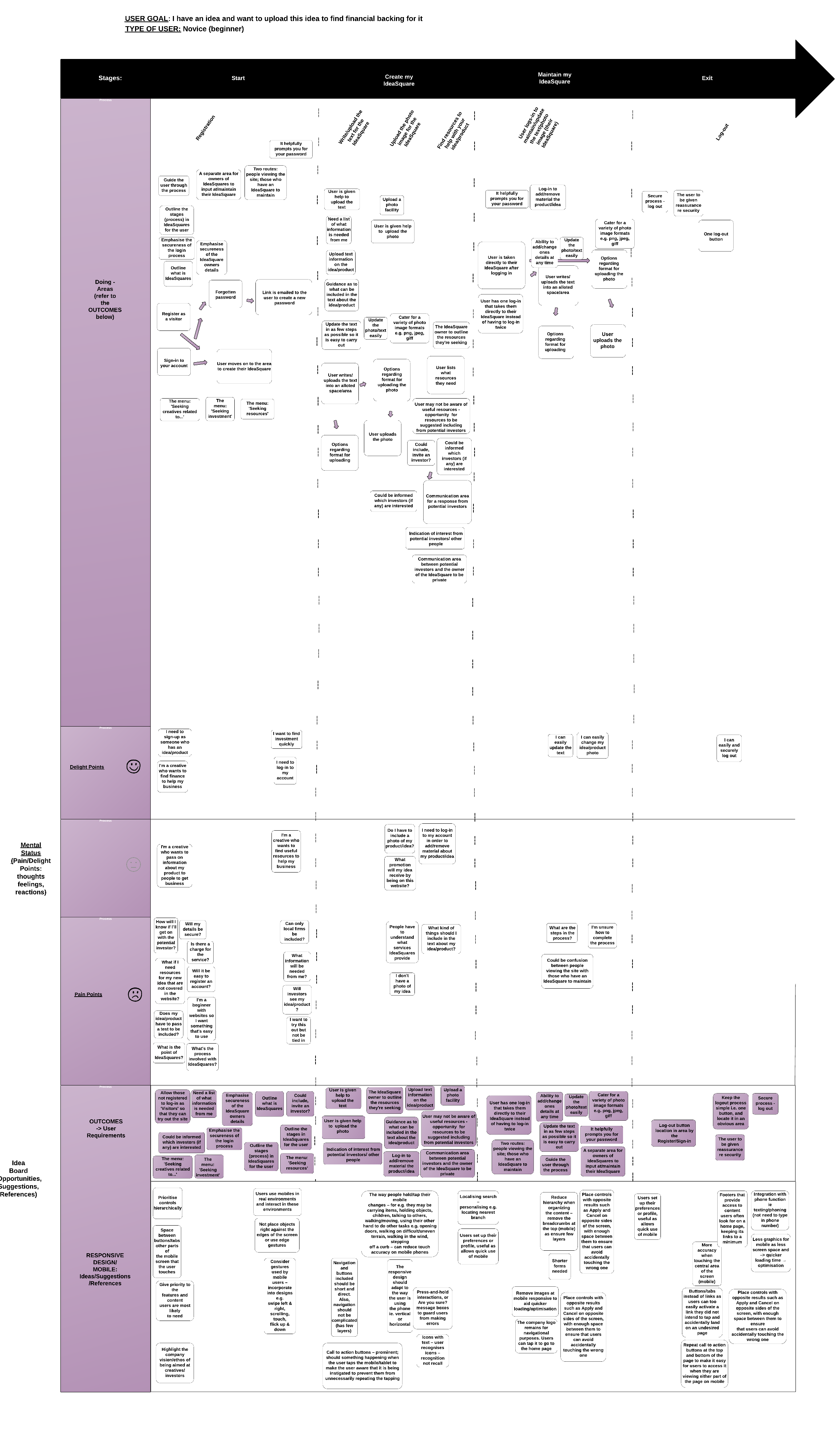
Experience Mapping
The Outcome
- Redesign of the website design and Information Architecture (IA) following relevant ISO guidelines, UX best practice, including Nielsen’s usability heuristics, interviewing people for usability/views/ideas as research, and A/B testing of designs
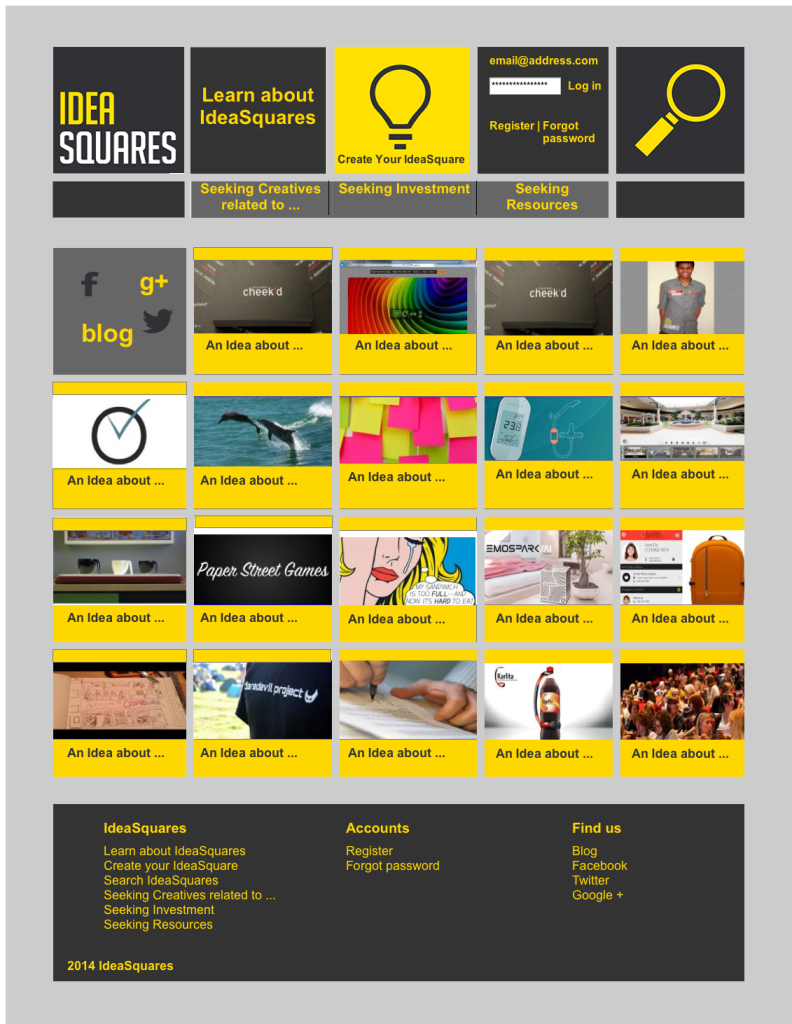
- New Information Architecture (IA), including the removal of duplication in the menu
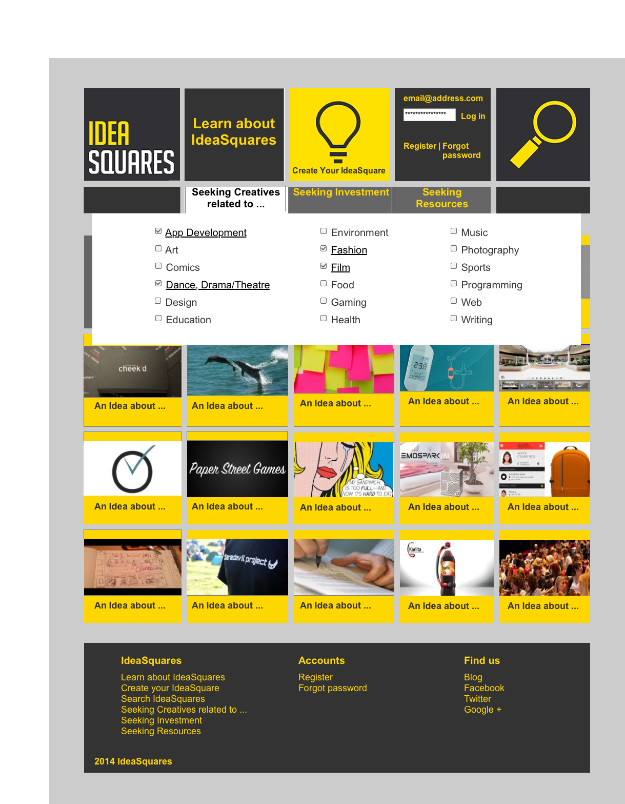
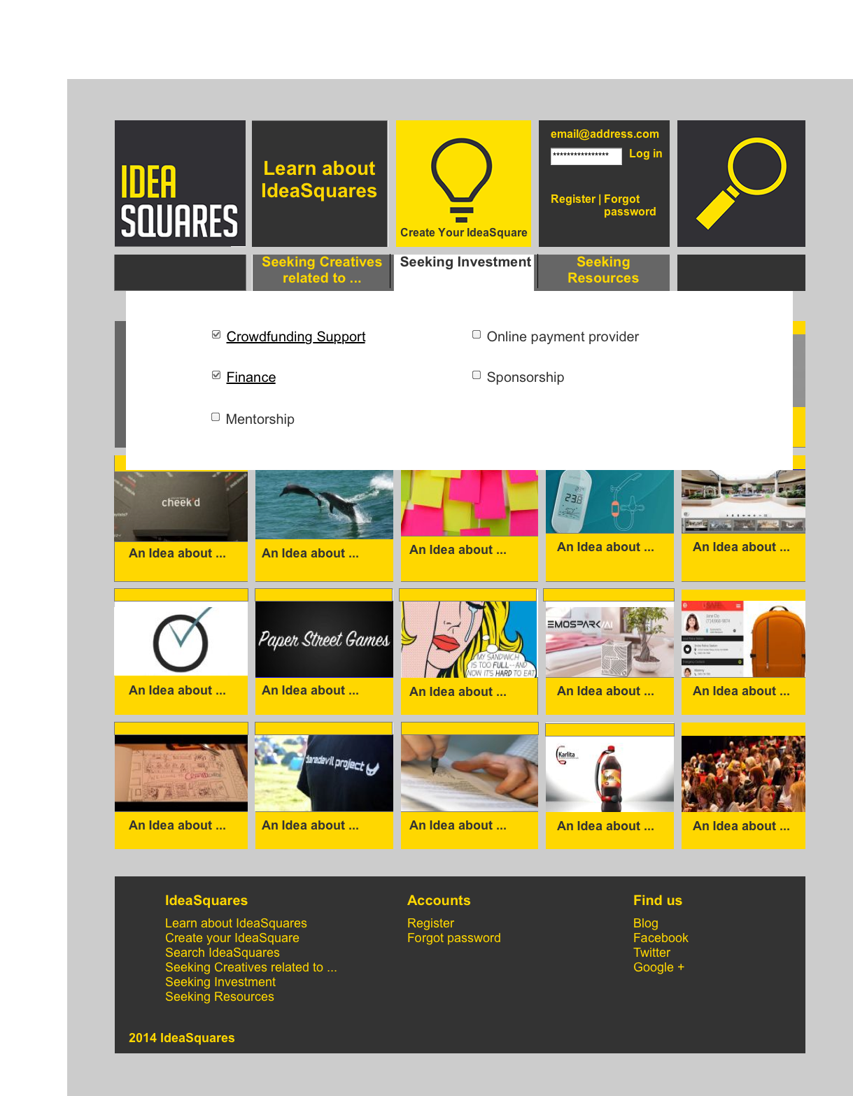
- Removed the original small drop-down menu that had a huge number of subject categories, replacing it with a larger style surface area for the main menu to aid usability and ensured the menu avoided subject duplication. Used card sorting for user validation
- Giving users feedback via the addition of the hover facility for the top menu bar
- Ensuring consistency via replacing several colours with a single gold colour for the IdeaSquares
- Added the square design feature to the main top menu in a colour different to those of the IdeaSquares on the page to make it easier for site users to find
- Changed the Information Architecture, removing the icon squares ‘Recently viewed’, ‘Most Popular’, ‘Latest Squares’ to avoid duplication
- Added a gold top to each Ideasquare to give balance
- Hovering over any IdeaSquares/main menu to give users feedback (a box colour change from gold to one other colour e.g. purple)
- Redesigned all 3 social media icons together with ‘blog’ with a link facility in a square directly under the top left home square to make it easier for site users to find
- Redesigned the ‘login’ above the ’email/register/forget password’ so that these together formed a square in keeping with the square theme to make it easier for site users to find
The Challenge
- To redesign the website design for usability alongside preconceptions
- To accommodate quickly in the website design, the constantly changing form of this new start-up
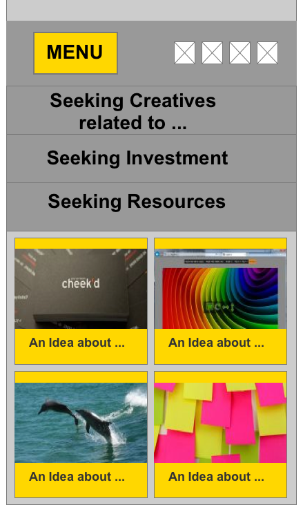
- A Responsive design, to take account of mobile and tablet usage
Click on the images & zoom in to view the detail
Initial Sketches
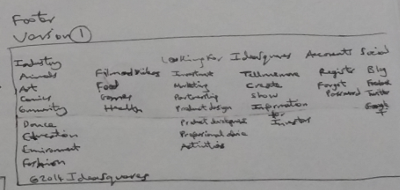
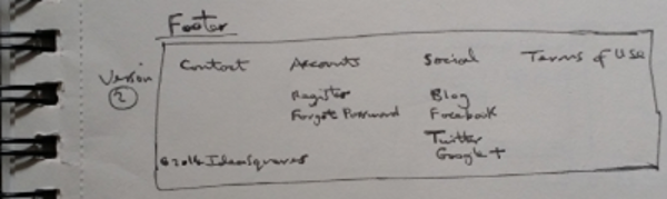
Header and Footer Sketches
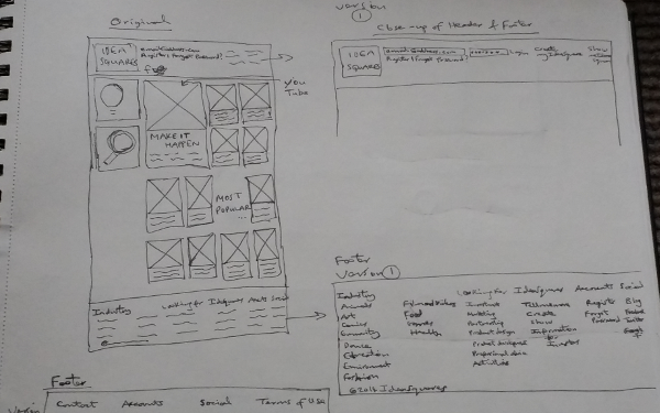


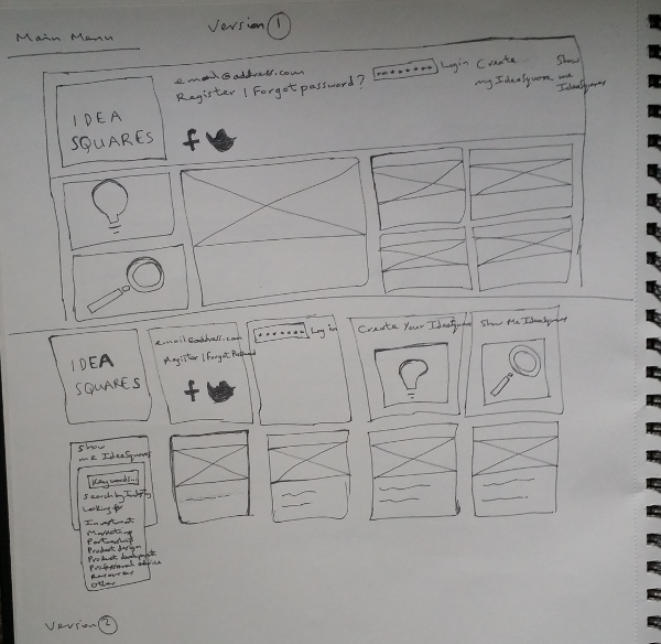
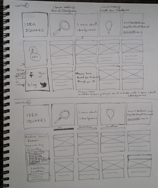
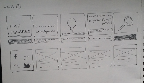
Main Menu Sketches
Outline of my work
I designed a new Information Architecture (IA) to:
- Removed duplication of subject areas and to make it easier for site users to finding the relevant areas
- Highlight the company vision/ethos of being aimed at creatives
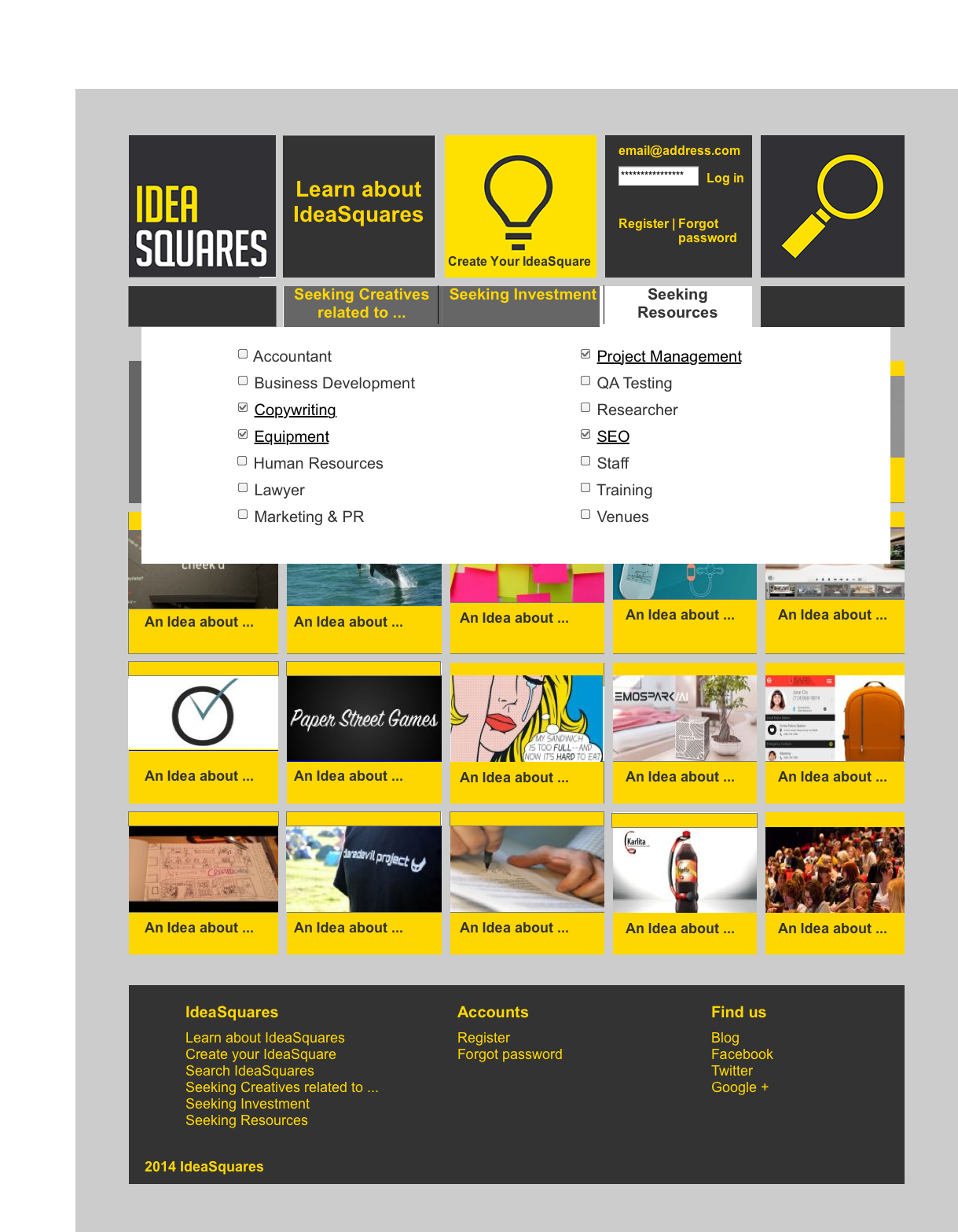
- Divided the Information Architecture (IA) into three areas, further to research: seeking creatives, seeking investment, seeking resources
Website design included:
- Research involved heuristic evaluation, A/B testing and talking to/interviewing people (target group) to refine the original website, making it more usable, catering for the needs of the target group
- Website page ‘mockups’ for the functional specifications
Click on the images & zoom in to view the detail
New Main page

New Main page – mobile view
Social media icons
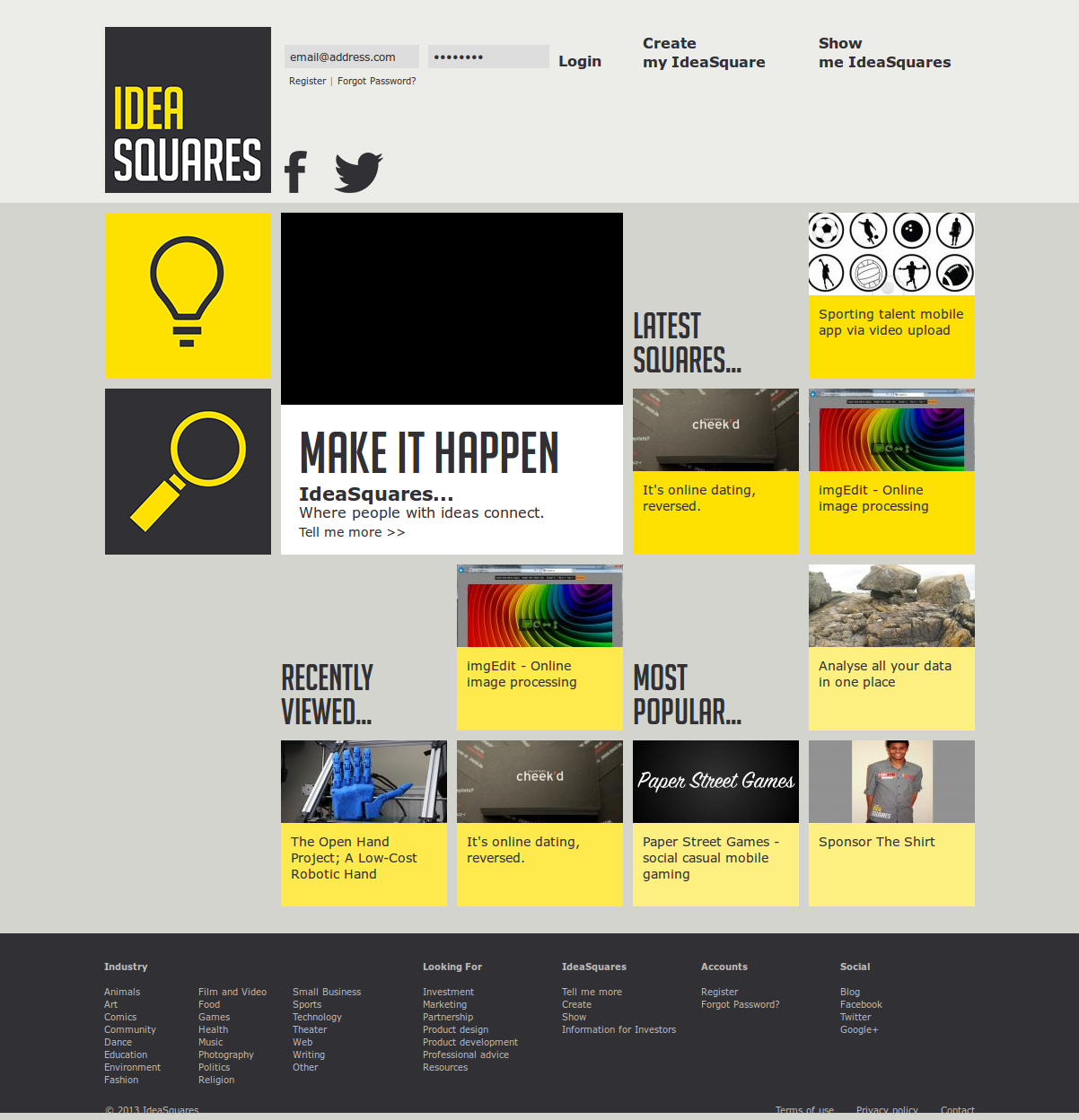
Client’s Original Main page
Click on the images & zoom in to view the detail
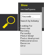
Client’s Original Menu
New Menu: Seeking Creatives
New Menu: Seeking Investment
New Menu: Seeking Resources