The Brief
An iOS and Android mobile app design centred on the theme of offers/discounts from eateries/bars and linking this to the time remaining for the offers.
Target audience: Spontaneous people, those aged under 30 years;
Measurable: Usability and understandability.
iOS app
Android app
Click on the images & zoom in to view the detail
Experience Mapping
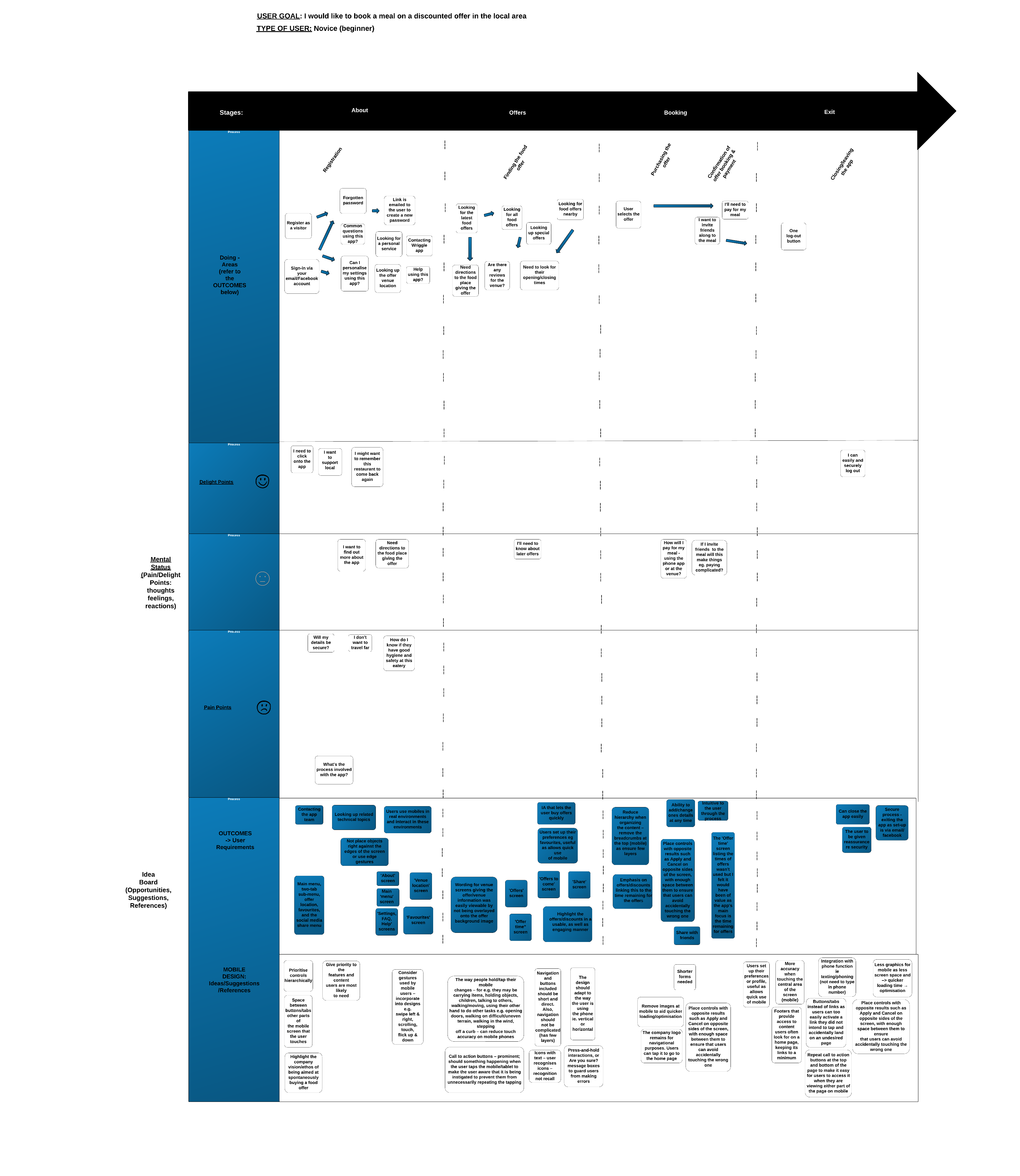
The Outcome
- Designing the iOS7/8 mobile app to the iOS7/8 mobile design standard and the Android app to the Android best practice
- Emphasis on designing a good user experience via a good navigation, IA, visual design and meeting the needs of the target user group; worked in a team with a Graphic designer and Visual designer
- Main menu, two-tab sub-menu, offer location, favourites, and the social media share menu
- The ‘offer time’ screen listing the times of future offers to be released as well as current offers wasn’t used, would have been of value as the app’s main focus is the time remaining for offers plus it would have given more of a pleasurable build-up re the offers
- The wording for venue screens giving the offer/venue information was easily viewable by not being overlayed onto the offer background image
The Challenge
- To accommodate quickly in the website design, the constantly changing form of this new start-up
- The emphasis on offers/discounts linking this to the time remaining for the offers
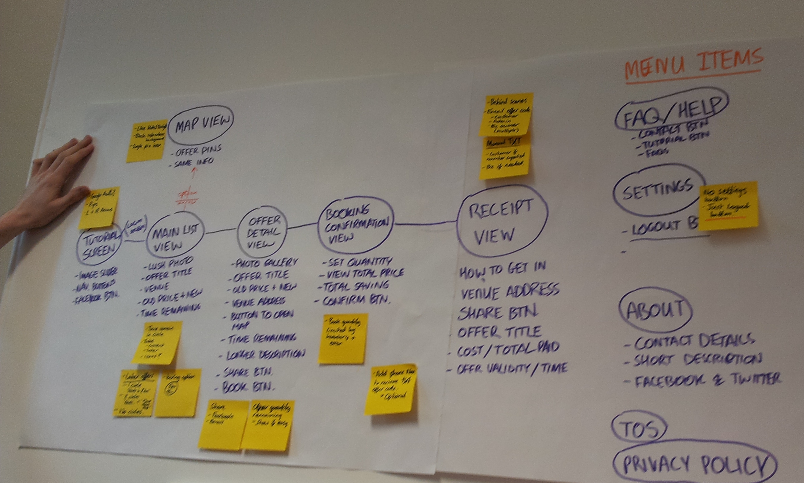
The App design
Two screens – Initial drawings

All of the App screen designs – Initial drawings
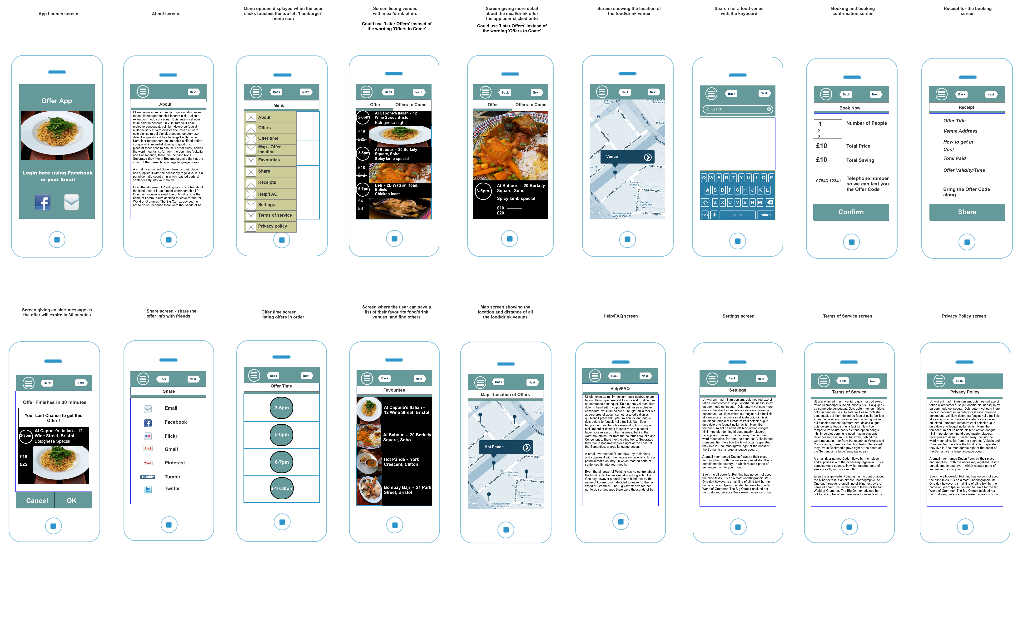
A close-up of each of the above screen designs is viewable here:
Screen designs – Initial drawings
Outline of my work
I designed a new Information Architecture (IA) to:
- Highlight the app vision/ethos
- Highlight the offers/discounts in a usable, as well as engaging manner
App design included:
- An app design following relevant ISO guidelines and UX best practice, including Nielsen’s usability heuristics
- Research involved creating personas/scenarios (with validation) from talking to the target group to ascertain their goals and tasks for the app, the target group being spontaneous people, those aged under 30 years. Making sure the navigation was usable, easy to understand, accessible and organised in an understandable way
- App page ‘mockups’ for the functional specifications
- Reviewed the apps YPlan, Yummly, Temptster, TopTable, Foodspotting, A Table, Yumtable, Bookatable, Hotel Tonight. The offer listings and the offer detail screen appearance was a result